
WeCare
WeCare
WeCare
UX Researcher
UI Designer
Tools
Role/Team
Figma
UX Researcher
UI Designer
Duration
A week
Oluwafunmilola Adeola
Redesigning Wecare - A cloth donating mobile application
Redesigning Wecare - A cloth donating mobile application
Project overview: The cloth donation mobile app is a platform that facilitates the seamless donation of clothing items to individuals in need.
Figma
A week
Duration
Role/Team
UX Researcher
UI Designer
Tools
Project overview: The cloth donation mobile app is a platform that facilitates the seamless donation of clothing items to individuals in need.
Oluwafunmilola Adeola
Redesigning Wecare - A cloth donating mobile app
Figma

The Problem Statement
The old version of the cloth donation mobile app lacks a cohesive and user-friendly visual design, hindering user engagement and detracting from its noble purpose of clothing donation.
Results from testing show that users have difficulties navigating the app due to inadequate colour choices, font readability issues, and insufficient contrast, leading to frustration and potential abandonment.
Consequently, there is a need to redesign the app's visual elements to optimize the user experience and encourage more effective cloth donations.
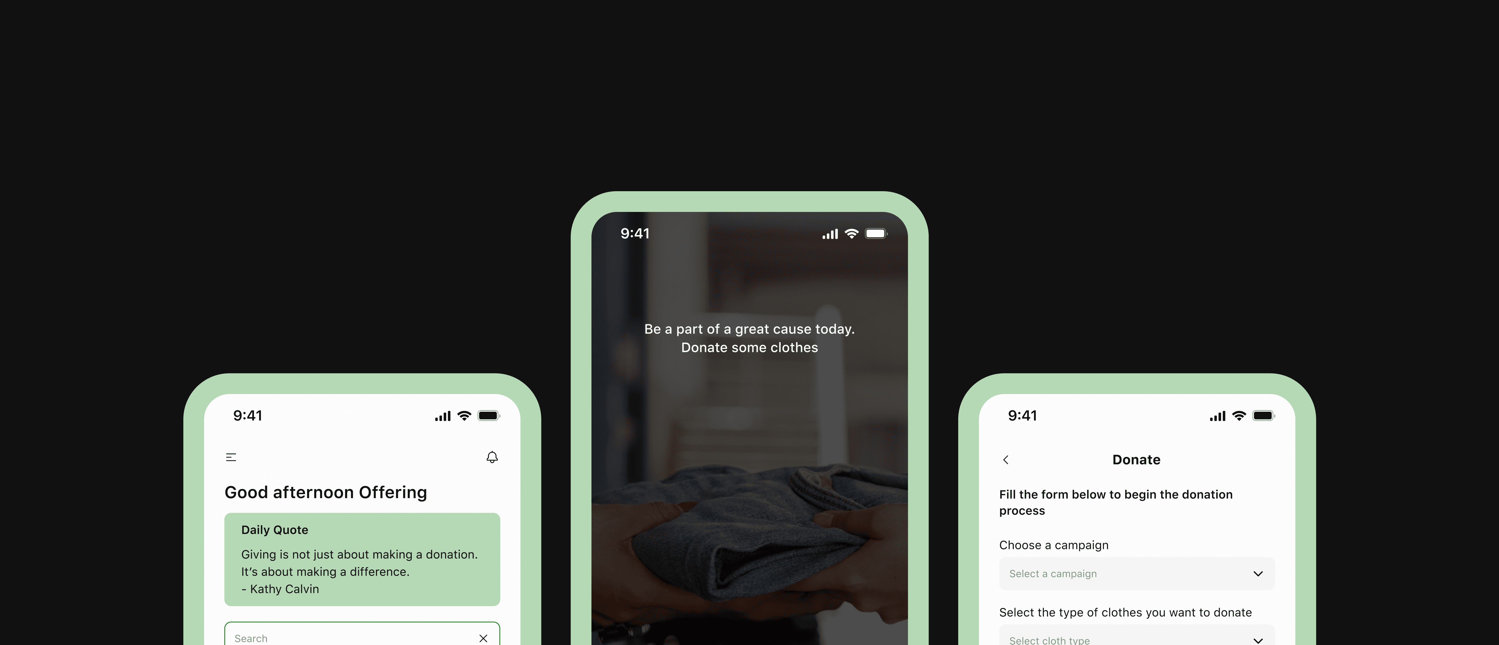
Fill the form below to begin the donation process
Choose a campaign
Select a campaign
Select the type of clothes you want to donate
Select cloth type
How many clothes are you donating in total?
Enter total number of clothes to be donated
Select donation option
Pickup
Drop-off
Proceed
Donate
Home
Donate
Profile
History
Pick-up
Dropoff
Donate
Text Field
Text Field
Text Field
Text Field
How many Clothes are You Donating?
Choose A Campaign
Describe Clothes
Add Pickup Address
Donate
OLD
NEW
The Problem Statement
The Problem Statement
The old version of the cloth donation mobile app lacks a cohesive and user-friendly visual design, hindering user engagement and detracting from its noble purpose of clothing donation.
Results from testing show that users have difficulties navigating the app due to inadequate colour choices, font readability issues, and insufficient contrast, leading to frustration and potential abandonment.
Consequently, there is a need to redesign the app's visual elements to optimize the user experience and encourage more effective cloth donations.
hhhjhs
High Fidelity Prototype Walkthrough
Objectives
Objectives
Objectives
Improved Color Scheme: Select a harmonious colour palette that aligns with the app's charitable mission, invoking feelings of empathy and compassion while maintaining readability and visual appeal.
Enhanced Font Readability: Choose fonts that are easily readable on mobile devices, considering factors such as size, weight, and spacing, to ensure a seamless reading experience for all users.
Contrast Enhancement: Optimize the contrast between text, buttons, and background elements to adhere to accessibility standards, catering to users with varying levels of visual acuity.
Streamlined User Experience: Redesign the app's interface to simplify navigation and streamline the donation process, making it intuitive and user-friendly for both new and returning users.
Brand Consistency: Maintain a consistent visual identity throughout the app to reinforce brand recognition and user trust.
Graphic Layout & Blueprint
Graphic Layout & Blueprint
Graphic Layout & Blueprint
The next plan of action was to create colour palettes and typography that would help communicate the brand’s identity and also give the product an exciting feel.
The next plan of action was to create colour palettes and typography that would help communicate the brand’s identity and also give the product an exciting feel.
The next plan of action was to create colour palettes and typography that would help communicate the brand’s identity and also give the product an exciting feel.
Style Guide
Style Guide
Style Guide
Icons
Body I
SF UI Text 14px
Body II
SF UI Text 14px
Button
SF UI Text 16px
Components
Home
Donate
Profile
History
Home
Donate
Profile
History
Home
Donate
Profile
History
Home
Donate
Profile
History
Home
Donate
Profile
History
LABEL
Enter text
LABEL
Enter text
LABEL
Enter text
Search
LABEL
Enter text
Claim Deal
Claim Deal
Claim Deal
Claim Deal
Web hosting
Web hosting

Splash Screen, Onboarding, Sign Up and Login Screens
Splash Screen, Onboarding, Sign Up and Login Screens
Splash Screen, Onboarding, Sign Up and Login Screens
The old design had just a splash screen/onboarding and the Sign Up and Login Screens with no title on the Sign Up page.
The old design had just a splash screen/onboarding and the Sign Up and Login Screens with no title on the Sign Up page.
The old design had just a splash screen/onboarding and the Sign Up and Login Screens with no title on the Sign Up page.

Home and Menu screens
Home and Menu screens
Home and Menu screens
The updated homepage features a labeled navigation menu. You can contribute directly to highlighted Campaigns on the homepage, and locate nearby drop-off centers based on the address details provided during your registration process.
The updated homepage features a labeled navigation menu. You can contribute directly to highlighted Campaigns on the homepage, and locate nearby drop-off centers based on the address details provided during your registration process.
The updated homepage features a labeled navigation menu. You can contribute directly to highlighted Campaigns on the homepage, and locate nearby drop-off centers based on the address details provided during your registration process.

Donation screens
Donation screens
Donation screens
The old design had no donation guidelines to guide the user on the rules governing the clothes donation and people could not choose to donate funds or make donation anonymous.
The old design had no donation guidelines to guide the user on the rules governing the clothes donation and people could not choose to donate funds or make donation anonymous.
The old design had no donation guidelines to guide the user on the rules governing the clothes donation and people could not choose to donate funds or make donation anonymous.

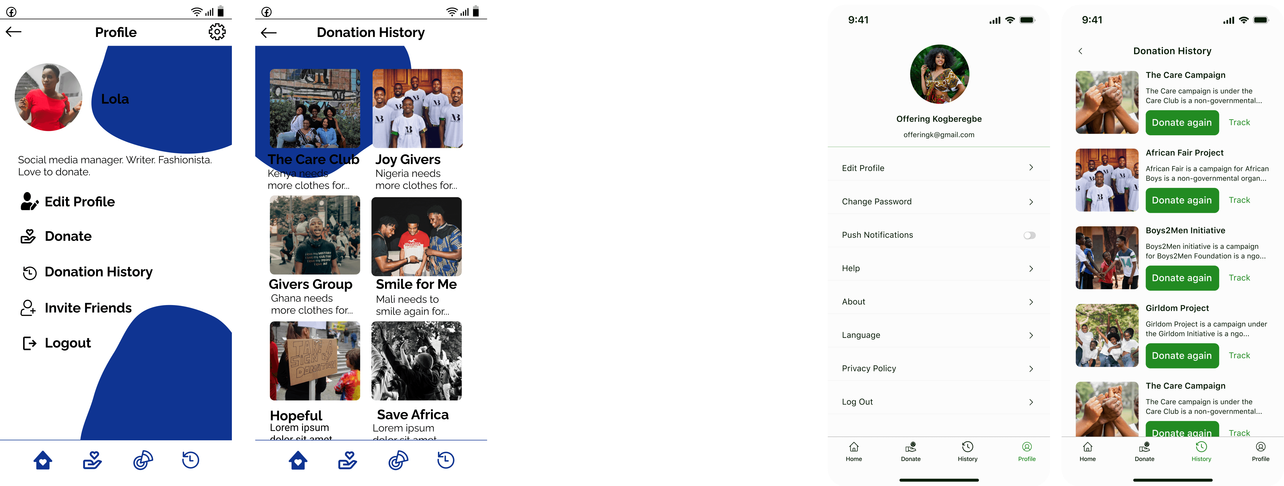
Profile and Donation History screens
Profile and Donation History screens
Profile and Donation History screens
The new profile page allows users to change password, learn more about the Application, and reach out for help. The new donation history page alllows users to donate again and check the status of the donation by tracking it.
The new profile page allows users to change password, learn more about the Application, and reach out for help. The new donation history page alllows users to donate again and check the status of the donation by tracking it.
The new profile page allows users to change password, learn more about the Application, and reach out for help. The new donation history page alllows users to donate again and check the status of the donation by tracking it.
Donation Center Screens
Donation Center Screens
Donation Center Screens
The new donation center page allows users to view more details about the center as well as donate directly to the center.
The new donation center page allows users to view more details about the center as well as donate directly to the center.
The new donation center page allows users to view more details about the center as well as donate directly to the center.

hhhjhs
High Fidelity Prototype Walkthrough
The careful selection of fonts has proven to be a highlight of the redesign. The chosen fonts strike a balance between a modern aesthetic and clarity, ensuring that users can easily consume information and navigate the app without strain.
The harmonious blend of colours not only resonates with the app's compassionate mission but also evokes a sense of empathy and warmth. Users have noted that the colour choices enhance the emotional connection to the cause while maintaining excellent readability across different sections of the app.
The attention to contrast ratios has resulted in a more accessible and inclusive app.
The seamless flow from one section to another has contributed to a more pleasant and efficient user experience, making it easy to donate.
Test: Validation, Usability, Feedback
The research helped me to confirm my solution and from there I created the LitPad app with these features;
LitPad gives users access to all books upon a subscription per month
LitPad has hundreds of books where some of them are newly released
LitPad is a simple application that satisfies the user's number one goal - to read books comfortably
LitPad allows users to give review as well as share books to friends.
LitPad allows users to read in-app
Conclusion
The research helped me to confirm my solution and from there I created the LitPad app with these features;
LitPad gives users access to all books upon a subscription per month
LitPad has hundreds of books where some of them are newly released
LitPad is a simple application that satisfies the user's number one goal - to read books comfortably
LitPad allows users to give review as well as share books to friends.
LitPad allows users to read in-app
In conclusion, the feedback from users regarding the redesigned cloth donation mobile app has been overwhelmingly positive.
The project's objectives have been met with excellence, resulting in an app that effectively blends aesthetics with functionality.
User experience has improved.
The careful selection of fonts has proven to be a highlight of the redesign. The chosen fonts strike a balance between a modern aesthetic and clarity, ensuring that users can easily consume information and navigate the app without strain.
The harmonious blend of colours not only resonates with the app's compassionate mission but also evokes a sense of empathy and warmth. Users have noted that the colour choices enhance the emotional connection to the cause while maintaining excellent readability across different sections of the app.
The attention to contrast ratios has resulted in a more accessible and inclusive app.
The seamless flow from one section to another has contributed to a more pleasant and efficient user experience, making it easy to donate.
Test: Validation, Usability, Feedback
Test: Validation, Usability, Feedback
The research helped me to confirm my solution and from there I created the LitPad app with these features;
LitPad gives users access to all books upon a subscription per month
LitPad has hundreds of books where some of them are newly released
LitPad is a simple application that satisfies the user's number one goal - to read books comfortably
LitPad allows users to give review as well as share books to friends.
LitPad allows users to read in-app
hhhjhs
High Fidelity Prototype Walkthrough
Conclusion
Conclusion
The research helped me to confirm my solution and from there I created the LitPad app with these features;
LitPad gives users access to all books upon a subscription per month
LitPad has hundreds of books where some of them are newly released
LitPad is a simple application that satisfies the user's number one goal - to read books comfortably
LitPad allows users to give review as well as share books to friends.
LitPad allows users to read in-app
In conclusion, the feedback from users regarding the redesigned cloth donation mobile app has been overwhelmingly positive.
The project's objectives have been met with excellence, resulting in an app that effectively blends aesthetics with functionality.
User experience has improved.
In conclusion, the feedback from users regarding the redesigned cloth donation mobile app has been overwhelmingly positive.
The project's objectives have been met with excellence, resulting in an app that effectively blends aesthetics with functionality.
User experience has improved.